ENS Logo Redesign
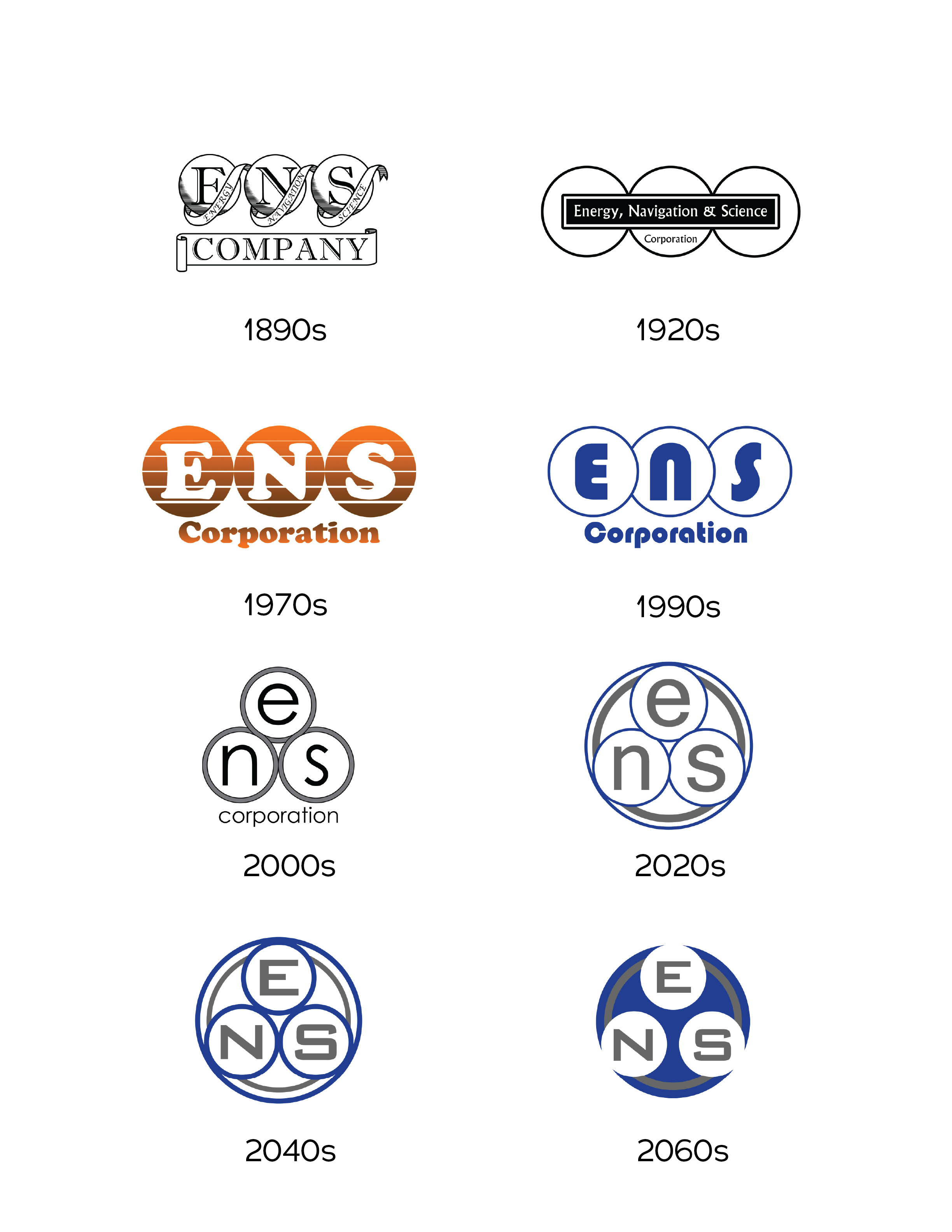
This project originated from a collaboration I did with a friend several years ago. The premise was a fictional company that had existed throughout two centuries, spanning from the past to the future. The earlier variations of the company logo were the ones I created. Looking back, we both agreed that the older brandmarks were stronger than the modern and future ones, so with his permission, I decided to create a new modern look.
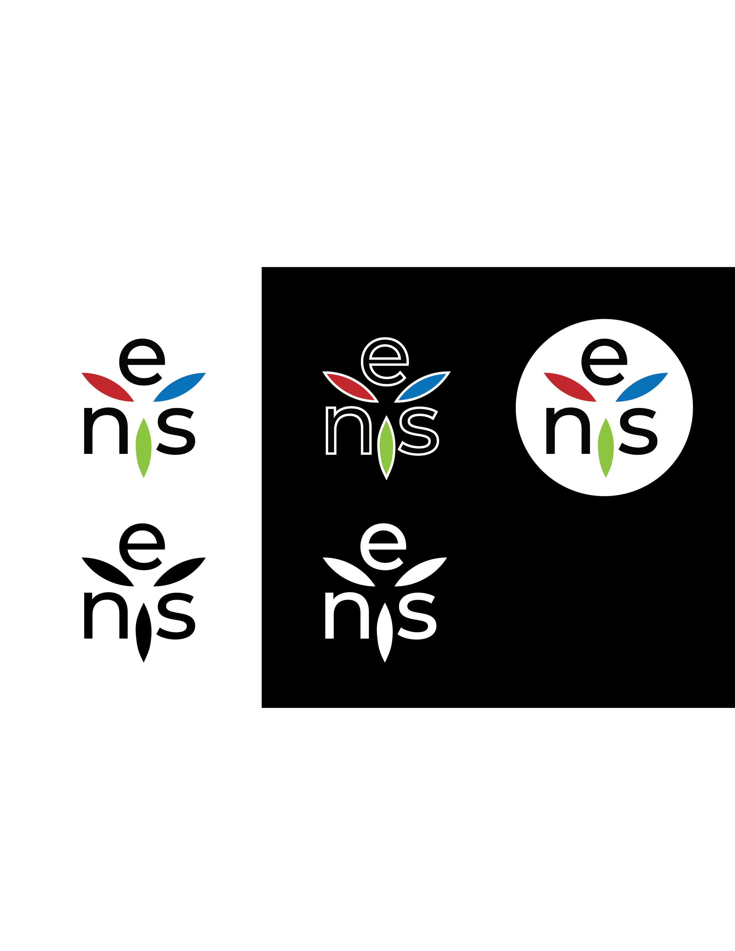
I originally intended to keep the three circles as part of a synergy with the ones depicting older eras, but instead decided to focus on the three shapes that were left behind when I intersected the circles. The RGB color scheme works with this new layout, but I did create a fully black and a fully white version.
With the new logo, I created an ad that would fit in a social media environment. My intent was to incorporate an image that would work with the logo. The one I used was most fitting since the orbit circles around the center of the image resembles the three shapes that are the main point of the logo.


