ENS Retro Ad Series
This is a three-piece series I created to expand upon a concept I had worked on years ago with a friend. The original project was to design a logo for an imaginary company that spans over a century, and it would involve various era appropriate logos. For this project, I took the idea one step further and created three magazine-style advertisements promoting the company with each one emulating the style and presentation of a given time period.
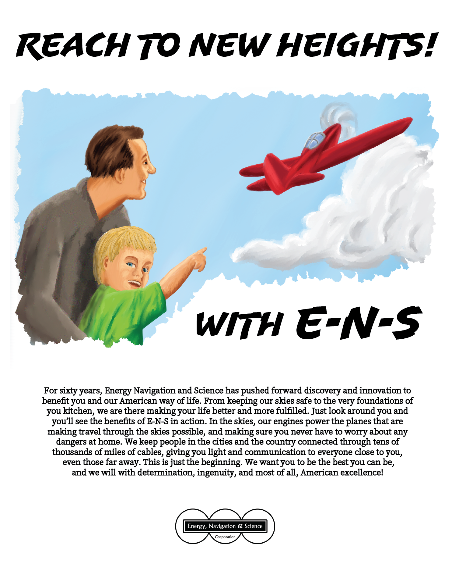
The first ad was designed to resemble advertisements of the 1940’s depicting an idealized world. A lot of research was required to achieve this mood. There were many themes that I was looking to emulate. The first was the painterly illustrated style, which was used by most print ads at the time. The second was the layout with an eye catching title, a strong supporting image, and the paragraph of information beneath it. This was a very common format at the time.
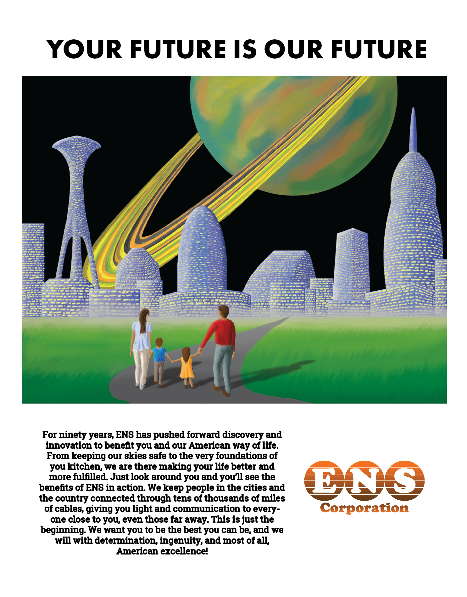
The second ad is set in the 1970’s. Most print ads relied more on color photographs, but I decided to keep it as an illustration with a seventies science fiction perspective. I focused on using a color palette that would be familiar at the time.
The third ad borrows from the 1990’s. Ads in this time period focused heavily on the strength of the image and much less on supporting text. I couldn’t help but be a little tongue in cheek with the text, boasting how amazing dial-up modem speeds were.


